The design
is a plan or construction of an object or a system. It may be an
architectural blueprints, engineering drawings, business processes, circuit diagrams or sewing patterns. The design has different connotations in different fields.
The design is what links creativity and innovation. It shapes ideas to become practical and attractive propositions for users, clients or customers. Design may be described as creativity deployed to a specific end.
Colour theory…
There are a few key points that I will expand on to show the importance of colour theory.
Colours convey strong emotional meaning to an audience.
Marketing research studies have been done regarding the subconscious
perception of colour and its ability to drive consumer behaviour.
Red, yellow and green have been shown to increase hunger and impulse
purchases, which is why we see this combination frequently used by fast
food chains and manufacturers of junk food items in retail packaging.
In western culture the following colours have the following meanings.
Blue is seen as reliable, conservative and dependable.
Financial institutions and insurance companies frequently
use this hue in their logos and promotional materials.
Yellow is a cheerful and playful color associated with fun,
energy and vitality. It can have the problem with not being
perceived seriously.
Brown suggests stability, reliability, and comfort. Studies have shown
that in times of economic uncertainty, consumers tend to purchase more earth tones for clothing and home décor.
Orange represents vitality, energy, and fun. It is considered the
most visible colour in the spectrum, so it is used in safety and
construction products that demand the attention of passersby.
Like yellow, it is not generally associated with sophistication and
refinement and is not always taken seriously
Purple is associated with mystery. Darker shades of this colour are associated with royalty and wealth. Purple is generally considered a feminine colour in advertising, packaging, and marketing.
Green is associated with freshness, growth and renewal.
This colour is used frequently to convey organic products.
Light green is perceived as tranquil and is frequently used
inside of hospitals and prisons.
Grey conveys a sense of refinement and sophistication.
We often see this used in the advertisement for luxury items.
It is a colour proven to decrease appetite, so it is not generally
used in restaurant settings or on consumer food packaging.
White is perceived as pure and innocent.
It is associated with cleanliness and sterility.
Black is a colour of mystery, fear and danger. In the west, it is
closely associated with death. In advertising and marketing, it is
often used as a colour to denote sophistication and masculinity
It is important to note that colour associations vary across world cultures.
For instance, the colour white suggests purity and innocence in the west,
but in some African and Asian countries, this colour is associated with death.
Red is the colour of lust and adventure in Western cultures, but symbolises
luck, prosperity, and marriage in Asian countries.
The above information only highlights how It is extremely important to research many cultures, beliefs and world trends when making a logo or design that you hope to be a global hit.
Colour Spectrum-
Colour is based on light Colour perception based on the two components: wavelength and luminosity Colour of light is determined by wavelength and how it hits a surface. there are certain Colours can exist beyond the spectrum visible to humans: ultraviolet and infrared light are examples.
to explain some terms used with colour i have highlighted the main ones below. Hue: Any single colour in the spectrum (red, yellow, blue, etc) Value: The relative lightness or darkness of a colour. Tint: A colour with white added.
Shade: A colour with black added. Saturation: The relative intensity or brightness of a colour Bright, vibrant colours (reds or oranges) have a saturation dull or muted colours (browns) have a low degree of saturation.
Like other elements of design, hue, saturation and value can be used
to emphasise certain areas of a composition or deemphasise others
Colours can balance, organise and harmonise a design, or to create discord
Colours with high saturation intensity and brighter value are more visible
and demanding of a viewerʼs attention
Colours with low saturation can be used to set apart secondary information
or to create background elements.
Primary Colours: Red, yellow and blue; the hues that form colour wheel base
Secondary Colours: Green, orange and violet; hues that are mixed
by combining two primary colours.
Tertiary Colours/Intermediate: Colours created by mixing a secondary colour and a primary
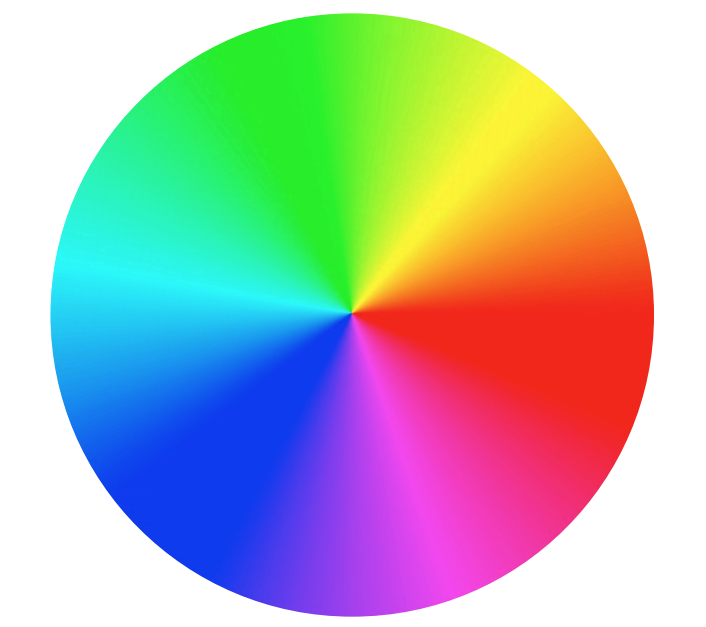
Complementary Colours: Colours that are opposites on the colour wheel that,
when combined, neutralise one another. Scheme provides strong visual
contrast and demands attention. For best use, de-saturate the cool colours
rather than the warm ones.
Analogous Colours: Colours that fall in adjacent proximity to each other on
the colour wheel, such as red, red orange, orange
Using analogous colours in a design creates unity and harmony.
Split Complementary: Colour scheme using a hue and the two colours that lay on either side of its compliment on the colour wheel
Provides more visual variety than complementary scheme; strong contrast
Harder to balance than monochromatic, analogous colour schemes
For best results, use one warm colour with a range of cool colours or vice versa and avoid de-saturated warm colours.
Triadic: Colour scheme uses three colours equally spaced around the colour wheel.
Provides strong visual contrast while adding balance and richness.
For best use, choose one colour to be used in larger amounts than others;
experiment with colour saturation and value.
Tetradic (Double Complementary): This is the richest of all the schemes;
utilises four colours arranged into two complementary colour pairs
Can be hard to harmonise; if all four colours are used in equal amounts, this scheme risks looking unbalanced and chaotic, so choose one colour to be dominant.
There are may ways as we have seen colours and design work together to great effect above, below I have given some examples of how to explore further with alternative methods:
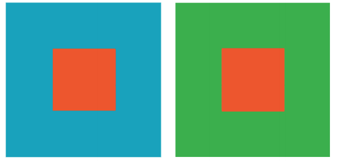
Simultaneous Contrast: The concept of colour perception based on
the other colours surrounding it.
Colour can look completely different when set against different hues,
and is perceived in relation to its surroundings.
Advancing/ Receding Colour: Warm and bright colours give
the illusion of being closer to a viewer within a composition,
while cool and dull colours appear to be further away.
Vibration: Complementary colors of equal saturation and brightness
compete with our eye for attention when seen in close proximity to
one another.
Weight: Colours differ in visual weight based on their hue and intensity.
For example, red is considered a “heavy” colour, and would demand
a viewerʼs attention, even if shown in only a small amount within a
composition.
Using Grids for designs…
The Benefits of Using a Grids in design are for Efficiency and flow of your project. Grids allow designers to quickly add elements to a layout because many layout decisions are addressed while building the grid structure. Economy — Grids make it easier for other designers to work and collaborate on the design as they provide a plan for where to place elements. I have included a few well respected and widely used frmats below:
Golden Ratio (or Rule of Thirds) Composition is important for any image, whether it’s to convey important information or to create an aesthetically pleasing photograph. The Golden Ratio can help create a composition that will draw the eyes to the important elements of the photo.
The Fibonacci Sequence is the series of numbers:
0, 1, 1, 2, 3, 5, 8, 13, 21, 34, …
The next number is found by adding up the two numbers before it.
- The 2 is found by adding the two numbers before it (1+1)
- The 3 is found by adding the two numbers before it (1+2),
- And the 5 is (2+3),
- and so on!
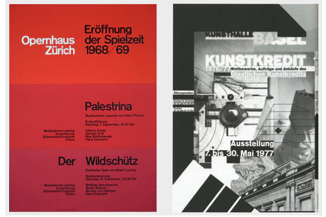
Breaking the grid-
Probably the most well-known rule of typography is to use a grid when designing. But that’s not your only option – playing with and challenging the typographic grid can lead to great designs too , as long as it’s done right!
There’s a long history of playing with the grid, and the ability to do so successfully is a mark of skilled designer.
Gestalt theory…
Proximity–We tend to group objects that are close together as part of the same object.
This iconic example from the Girl Scouts presents three faces, two outlined in white, one in green. However, they appear to be a part of the one item. It can be perceived as both separate faces or one image..

Similarity: we tend to perceive things that physically resemble one another as part of the same object.
In this example from Sun Microsystems, the SUN logo contains a U and an upside down U; however, when they are together, they look like they are forming the word “SUN”, and are part of the same logo.

Continuity: When we see one object, but are compelled to move through another object; when our eyes naturally follow a line.
In this example, our eyes follow from the C in Coca to Cola. We then follow the C in Cola through to the L and A in the word. This helps our eyes continue to move through the word.

Continuity: When a shape is not complete, but enough of the shape is shown, our minds will fill in the blanks and construct the whole of the shape.
In this example, there are spaces missing in the panda bear’s head and back. This is normally where the white fur would be; however, because most people are familiar with the shape and color of a panda, we are able to perceive it as that animal.

Typography…
Is the Anatomy of letterform broken into the following categories:
• Evolution of letterforms & type classifications
There are an overwhelming amount of fonts, but the main two categories of fonts out there are.
Serif: Serif is the slight projection at the end of a stroke that’s most commonly seen at the bottom of letters. If you look closely, some fonts will have “little feet” on them. This is what characterizes it as being a Serif font. This allows the eye to flow through sentences with ease.
Sans Serif: Fonts that are Sans have no “feet,” or serif.
• Type terminology typefaces, type styles & type
families
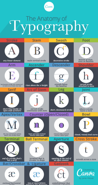
• Measurements of type, font types are measured in picas. there are lots of parts to think of including ear, counter, ascender, apex, beak, crotch, vertex, when making and measuring fonts
• Line spacing
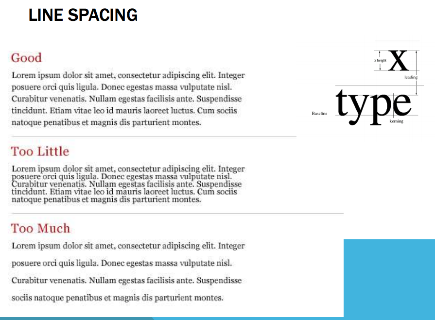
• Letter spacing and word spacing is known as kerning
• Working with large bodies of type it is improtant to use the correct fonts and sizes, a few key points are listed below:
- The most legible fonts are Arial, Courier, and Verdana.
- At 10-point size, participants preferred Verdana. …
- At 12-point size, Arial was preferred and Times New Roman was the least preferred.
- The preferred font overall was Verdana, and Times New Roman was the least preferred.
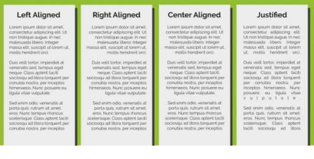
• Alignment for large bodies of type is a very important skill, to make it easy for the user to read and continue to be engaged with, Below you can see, although they all will be suitable for different needs. 90% of the time left aligned is the simplest and easiest to read and keep reading.
• Choosing and using a typeface worthwhile spending time on as some fonts may come across as casual, while some may look formal and professional. Others show fun and carefree identity, while some give you an impression that they’re meant to be used for more serious things. This is what typefaces do. They give any text they are used on its own personality, allowing people who read it to identify with it more effectively. once coupled with your target market research it can become an effective tool.